What does your store front say about you and your business? Is it attracting potential new customers, or could it – gasp! – be putting them off?
These were among the questions tackled in the latest in our Mastermind Forum discussions*. Session host Cheryl Thallon (owner of Sheaf Street Health Store) had prepared a punchy presentation, packed with tips and insights. From thoughts on “welcoming windows” and inviting colour schemes, to suggestions on making your store more approachable – there was something for everybody to take away and put straight into action.

Implementing ways to encourage shoppers to stop, look and enter your store ought to pay good dividends. As Cheryl put it, since just 5% of the public shop in independent health stores there is a “massive opportunity to STOP the other 95% walking past!”.
Cheryl suggests a checklist approach, based on her ‘8 Cs’. Here they are:
Clean – What’s the first impression?
“Don’t forget basic hygiene. People like to see a clean, bright shop. Let’s avoid people thinking, is this ‘buy one, get 20 dead wasps free’?”.
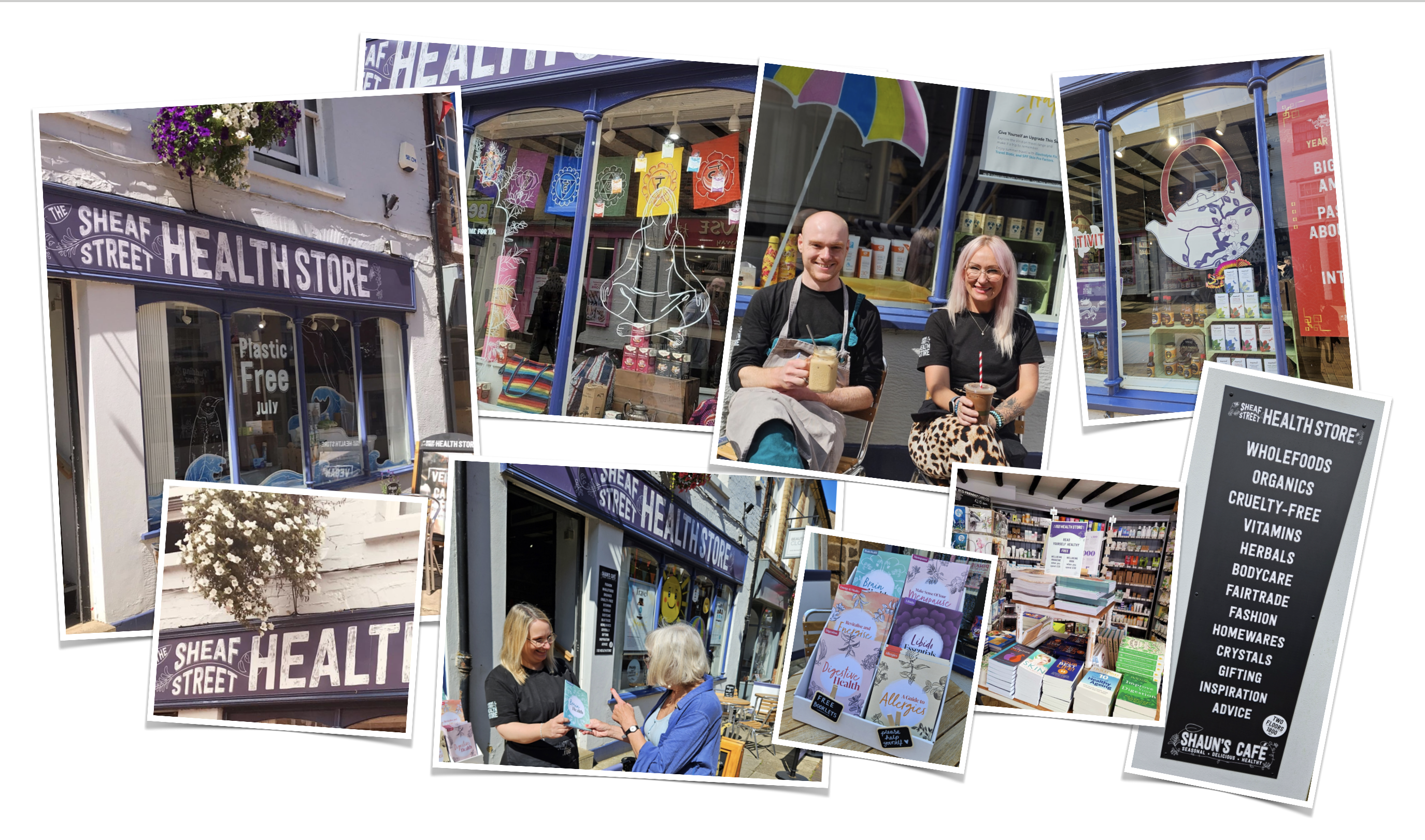
“Make sure your store looks welcoming. Think about a paint job refresh. Or maybe commissioning a hand-painted wooden facia board.”
Character – Is it clear what your business is?
“Does your store name, colour palette and window display tell people enough about the nature of your business? If not, you could be losing custom without realising it.”
Challenges – Can people see inside?
“Think about how you enable potential customers to view into the store. Try to create a vista that leads the eye into your store.
“A surprising number of those 95% of people who don’t shop in independent Health Stores think there’s something weird going on inside! Here’s your chance to show there isn’t – usually!”
“Make your window displays approachable. We deliberately do quite a few tea-focused displays. No one is scared of tea, it’s a non-threatening gateway category.”
“On the subject of tea, try offering a small complementary cup of tea as to people as they enter your store. It’s welcoming – but it also slows people down, which increases the chances that they will leave with more than just the one product they came in for.”
“Try to avoid too many negative messages in your signs”.
Curiosity – Is your knowledge and expertise visible?
“Aim to create curiosity. For example, display free leaflets and booklets outside your door (we find they just fly). Set out tables and chairs in front of your store, if you have space, to convey that you are open, welcoming – and that something is going on”.
Cheerleader – Shout out where you can
“Use A-Boards (we vary ours 2-3 times a week) and additional signage to create interest. We found that a simple chalkboard-stye sign listing all the product categories we stock led to a significant sales uplift”.
“DO display your opening hours, otherwise you are letting your customers down!”.
Community – Can you create a social place?
“If you have space, create a cafe or meetings area. Clubs and Chatty Cafes help strengthen your place in your local community.”
Cheerful – Add some nature or upbeat colours?
“Health conditions – joint health, gut problems, anxiety and so on – are health store staples. But they don’t necessarily project upbeat vibes. Hanging baskets and other splashes of ‘nature’ add cheerfulness, as do upbeat colour schemes.”
Campaign – Show that you are great value (without cheapening)
“Find ways to project that you offer great value. Flag up promotions and the free in-store advice you offer. Take your products out onto the street with samplings. These are great conversation starters and an opportunity to reinforce your value message, further differentiating you from the chains.”
